MATCHING THE STAKES
Content design for crypto isn't just about writing warnings. I build the systems that decide how and when we talk to users when their money is on the line, and the line is final.
Risk communication that's clear when it counts, and calm when users aren't.
UNDERSTANDING THE USER'S MIND
"Wait, what just happened to my account?"

Thinking about what our users want

Detecting the early signs

Let the data talk
Thinking about what our users want
Problem
For most users, a Risk interaction means something has gone wrong or could go wrong. An account restriction, a withdrawal block, a security check. Content has two jobs here: manage their anxiety, and get them to act.
Research
Defining success in this domain is tricky with the HEART framework. What does happiness look like for a user who can't withdraw their funds? Does engagement even exist when the goal is for them to understand warnings, not click through? Adoption, retention, task success...each one means something different in Risk than anywhere else in the product.
Challenges
No shared definition of what good Risk content even looked like. Existing copy was inherited from Legal, Product, and Engineering. Each team writing for their own business lines and agenda. None for the user.
Solution
A content North Star from the HEART:
-
Happiness: users feel in control when incidents happen.
-
Engagement: users respond quickly to critical prompts and don't dismiss them.
-
Adoption: users complete required tasks in one session, with minimal drop-off.
-
Retention: users stay invested after an incident. Not despite us, but because of us.
-
Task success: users finish KYC verifications, document uploads, and video checks accurately and on time.
Impact
Shared language across Product, Legal, Customer Support. Stopped arguing about copy. Started arguing about goals.
REDEFINING THE EXPERIENCE
"Less panic. More clarity."
Problem
Risk communication was fragmented. Every business line wrote its own warnings with different tones, structures, and escalation logic. Users couldn’t tell when something was a friendly nudge versus a serious threat. Which is the exact opposite of what risk communication is supposed to do.
Research
Audited every risk-related touchpoint across the product, web, and email. What signals do we receive? What actions can we take? What is the user’s state of mind at each severity level? The fix wasn’t going to be better copy. It needed to be a framework.
Challenges
A framework only works if every team adopts it. Each business line had its own reasons for why their warnings looked the way they did. Designing the system was the easy part. The harder problem was buy-in. How do we convince every product team that this framework is better?
Solution
A four-tier model that varies in tone and intent. Tiers 1–2 (advisory): generic, educational, scalable. Tiers 3–4 (directive): specific, immediate, actionable. Not forgetting context, impact, next steps, education, support, sign-off. Six components. Infinite scenarios.
Impact
A scalable, reusable content framework that turns risk warnings into a system. Built to absorb new scam types and business lines without rework. Adopted as the foundation of risk communication across the platform.

What's in a risk warning?

Educate

Block, act
What's in a risk warning?
GETTING TEN OPINIONS TO SOUND LIKE ONE
"Pick a voice and stick to it."


Inform, educate, support
Problem
A Ponzi scheme had affected a portion of our users, and the team needed to restrict withdrawals for these affected accounts. Three stakeholders, three agendas:
-
Customer Support wanted it shipped yesterday so they could stop the panic tickets.
-
Legal wanted the jargon and legalese that kept them safe.
-
Users, whose accounts had actually been touched, needed to understand what was happening to their money.
The default outcome of conversations like these is usually the worst of all three.
Research
Pulled the original draft from Legal and the asks from Customer Support. The pattern was familiar: the draft led with the system, not the user. Internal jargon the user had no context for. Education buried in three paragraphs at the moment a user is least equipped to read them.
Challenges
Every stakeholder had a legitimate concern. Legal couldn't accept anything that exposed the actual risk mechanics. CS couldn't wait. Risk Strategy didn't want users to feel attacked. The fix had to satisfy all of them without diluting the user experience...and ship the same day.
Solution
Listened first, proposed second. Brought a before/after to the table so the conversation was about the work, not about preferences. Framed the UX case as a strategy, not as taste.
Replaced the original draft (alarming, distant, verbose) with an email template that gave users context without exposing the risk mechanics, an impact line they could actually absorb, and a scam education section nobody asked for but everyone needed.
Impact
-
All stakeholders happy. Shipped in one day.
-
Template adopted as the spine for unified email notifications across the platform.
-
40% drop in panic tickets for CS
RISK STARTS FROM WITHIN
"Are we sure we should block our users here?"
Problem
The Risk Strategy team configured events manually in the rule engine with string entry, boolean toggles, and no guardrails. Steep learning curve for newcomers, prone to human error, no clear understanding of what a wrong action would actually break. In Risk, “close enough” doesn’t create UX debt. It lets bad actors through and blocks good users.
Research
Interviewed the team to find where they stalled. The pattern was consistent: labels were ambiguous, consequences were invisible, and a wrong move always felt one click away. Product managers were spending 30–60 minutes per event just to be sure they weren’t breaking something.
Challenges
Internal tools don’t typically get content design attention. Half the work was making the case that the people configuring risk deserve the same content care as the people receiving it. The other half was redesigning without slowing down the experienced users who could already navigate the existing chaos.
Solution
-
Audited every label for accuracy, not just clarity. Blacklist or blocklist? Overwrite or save? These terms had been used interchangeably when they shouldn’t be.
-
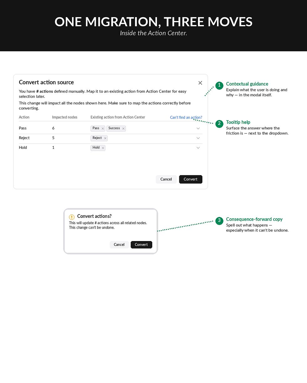
Designed contextual guidance, confirmation modals, and consequence-forward tooltips for the moments people got stuck.
-
Built easily configurable actions that users can map from existing manual entries. No rewrite needed.
Impact
-
Migration time per event: 30–60 minutes → under 5 minutes
-
2 business lines onboarded
-
4 events migrated
-
The Risk Strategy team didn't need convincing. They asked to join.

Designing a user-friendly platform for our product team
Migrating from manual entry to defined configurations
Designing a user-friendly platform for our product team